Gists
Abstract
This report presents a workaround for copying a sheet, including its charts, from Google Spreadsheet “A” to Google Spreadsheet “B” using Google Apps Script.
Description
In this report, I would like to introduce a workaround for the following goal:
- Copying a sheet including charts from Google Spreadsheet “A” to Google Spreadsheet “B” using a script.
In general, when Sheets API is used, all objects of the Spreadsheet can be copied easily. However, when I tested this, I noticed the following problems:
Gists
This is a sample script for correctly exporting the charts on Google Spreadsheet as the images using Google Apps Script. In the current stage, using Google Apps Script, when the charts on Google Spreadsheet are exported as the images, it seems that the exported images are not the same with the original one on Google Spreadsheet. About this, today, I could notice that I had answered for 2 questions. Q1, Q2 And also, I had already been reported this at the issue tracker. Ref
Gists
When a chart is created by using EmbeddedChartBuilder of Spreadsheet service, the title of vAxis which is put by setOption("vAxis", {title: "y axis"}) doesn’t work. It is considered that this is a bug. Because I have confirmed that this had worked fine. Ref But this specification had been changed. So I would like to introduce the method for adding the title of vAxis when a chart is created using Google Apps Script.
This sample script is for retrieving parameters from a chart. The chart created by both Google Apps Script and manually operation can be used.
Creates Chart
When a chart is created, it supposes following parameters.
var parameters = {
  "title": "x axis",
  "fontName": "Arial",
  "minValue": 0,
  "maxValue": 100,
  "titleTextStyle": {
    "color": "#c0c0c0",
    "fontSize": 10,
    "fontName": "Roboto",
    "italic": true,
    "bold": false
  }
};

.setOption('hAxis', parameters)
Retrieve Parameters From Chart
For the chart created by above parameters, in order to retrieve the parameters, it uses following script.
This sample script embeds a chart to a cell using custom function on Spreadsheet.
I think that this method is one of various ideas.
Problem
When you want to create a chart and embed it to a cell using custom functions, you notice that insertChart() cannot be used. There are some limitations for using custom functions. But insertChart() creates floating charts. So in order to embed a chart to a cell, the function =IMAGE() is suitable for this situation. Here, setFormula() for setting =IMAGE() and DriveApp.createFile() for creating images from charts also cannot be used for custom functions.
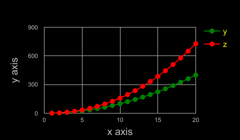
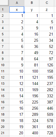
Sample data
This is a sample data for this sample script. The column B was created by the normal distribution formula, and the column C was created by multiplying random number for column B.
A, B, C
1.0, 0.0001, 0.0000
1.5, 0.0009, 0.0006
2.0, 0.0044, 0.0037
2.5, 0.0175, 0.0133
3.0, 0.0540, 0.0236
3.5, 0.1296, 0.0533
4.0, 0.2420, 0.0073
4.5, 0.3522, 0.2468
5.0, 0.3990, 0.0843
5.5, 0.3522, 0.3352
6.0, 0.2420, 0.2201
6.5, 0.1296, 0.0607
7.0, 0.0540, 0.0256
7.5, 0.0175, 0.0006
8.0, 0.0044, 0.0030
8.5, 0.0009, 0.0005
9.0, 0.0001, 0.0001
Create chart
createChart() creates a chart from data. A chart with 2 lines is created by this method.
 var sheet = SpreadsheetApp.getActiveSpreadsheet().getActiveSheet();
 var chart = sheet.newChart()
    .setChartType(Charts.ChartType.LINE)
    .asLineChart()
    .addRange(sheet.getRange('a1:a21'))
    .addRange(sheet.getRange('b1:b21'))
    .addRange(sheet.getRange('c1:c21'))
    .setColors(["green", "red"])
    .setBackgroundColor("black")
    .setPosition(5, 5, 0, 0)
    .setPointStyle(Charts.PointStyle.MEDIUM)
    .setOption('useFirstColumnAsDomain', true)
    .setOption('height', 280)
    .setOption('width', 480)
    .setOption('title', 'Sample chart')
    .setOption('hAxis', {
      title: 'x axis',
      minValue: 0,
      maxValue: 20,
      titleTextStyle: {
        color: '#c0c0c0',
        fontSize: 20,
        italic: false,
        bold: false
      },
      textStyle: {
        color: '#c0c0c0',
        fontSize: 12,
        bold: false,
        italic: false
      },
      baselineColor: '#c0c0c0',
      gridlines: {
        color: '#c0c0c0',
        count: 4
      }
    })
    .setOption('vAxis', {title: 'y axis',
      minValue: 0,
      maxValue: 800,
      titleTextStyle: {
        color: '#c0c0c0',
        fontSize: 20,
        italic: false,
        bold: false
      },
      textStyle: {
        color: '#c0c0c0',
        fontSize: 12,
        bold: false,
        italic: false
      },
      baselineColor: '#c0c0c0',
        gridlines: {
        color: '#c0c0c0',
        count: 4
      }
    })
    .setOption('legend', {
      position: 'right',
      textStyle: {
        color: 'yellow',
        fontSize: 16
      }
    })
    .build();
    sheet.insertChart(chart);